At the center of any quality digital marketing campaign is a landing page. Here, marketing leads are funneled with the goal of turning those leads into conversions.
A conversion might be getting a customer to sign up for a sales event, register for a recall service, or even request information about a specific vehicle.
Regardless, the landing page where you send customers is integral to the success of your marketing campaign.
We are going to take a look at the nine signs that indicate your landing page is actually costing you leads, as well as some key takeaways for how you can better optimize your landing page to reduce lead loss.
1. Your Landing Page Doesn’t Match Expectations
Picture this scenario. Customers are searching for a new Toyota. They are potentially interested in making a purchase and want to see if any nearby dealerships are offering promotions or deals.
They Google “Toyota sales events near me.”
Next, they click on a Google ad for a nearby event.
At which point, they are taken to a landing page. But when they get to the page, they see a banner image of a dealership, information about the makes and models that the dealership sells, as well as the entire website’s navigation bar.
While there is information about Toyotas on this page, the customers were specifically looking for a sales event and thought they would see a date, time, and location for a nearby event. Uninterested in scrolling through the rest of the information, they leave the page and go back to their search results.
What happened?
The landing page didn’t meet the expectations of their search. And, even if that page contained information about an upcoming sales event, it was buried too far down the page.
The result? Customers leave and go in search of a faster answer.
What to Do Instead
Start with the appearance of the landing page. Use an image or banner at the very top of your landing page that quickly identifies what the page is about.
For example, if you target an audience searching for a sales event, make sure the very first thing they see is the basic information about your sales event.
Don’t overdo it with too much information. The key is to focus on the users’ intent and what they expect to see.
2. Your Message is Clouded
Have you ever landed on a webpage that contained every detail imaginable about a business? Perhaps the webpage was crowded with images, banners, headers, and lengthy paragraphs of text.
Too often, businesses try to build a landing page that will answer every question that every customer might have.
The result is that the message of the landing page is clouded. Customers won’t dig through a ton of information to find what they are looking for. They will bounce. And on the other side of that bounce is your competitor, waiting to reach your customers.
What to Do Instead
Be clear and concise. Stick to a single message, and focus on providing a value that a customer can’t beat.
You can’t create a single landing page that will be ideal for every person, so don’t try. Instead, focus on a specific target audience, and build your page with messaging for that audience.
To see if you are hitting the mark, give your landing page a five-second test. Could a customer figure out what the message of the landing page is in five seconds or less? If not, it’s time to hone in on your message and cut out the noise.
3. Your Headline Isn’t Engaging
The first thing customers will scan when they reach your landing page is the headline. The headline of your landing page should grab their attention and keep them reading.
Often, a lack of conversions from a landing page can be attributed to a poor headline.
Attributes of an unengaging headline include:
- Generic terms
- Lack of emotion
- Too lengthy
- Unclear
What to Do Instead
So how do you write an engaging headline?
Start with a simple question from the perspective of your customer: “What’s in it for me?”
Your headline should quickly and clearly let the customer know the benefit of taking action or reading on.
Additionally, don’t be afraid to test out a few headlines as you run your campaigns. This can help you learn more about what messaging is best for engaging with your audience.
Over time, you can continue to narrow in on the headlines that lead to the highest conversions.
4. Your User Experience is Poor
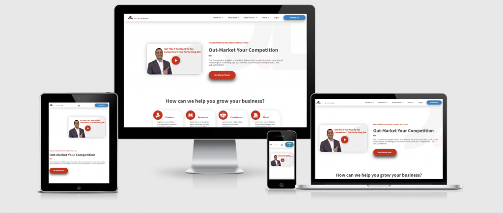
Your customers might access your landing page in a myriad of ways. They might be browsing the internet on their desktop, laptop, tablet, or phone. But, no matter how they view your landing page, they should be able to navigate the page easily.
If your user experience is poor, people will leave without converting. A poor user experience might include any of the following:
- Excessive scrolling to get to pertinent information
- Buttons that are unresponsive on mobile devices
- Forms that are not device-responsive
- Calls to action that are hidden beneath the first screen load
- An overwhelming amount of text that is not broken up by headings
What to Do Instead
Test your landing page on every device type. Then, check that the information displays correctly and that you can navigate through the landing page seamlessly.
Make sure that your call to action is within easy reach, even on a small mobile device. Reduce the need for scrolling as much as possible.

5. You Have a Weak Call to Action
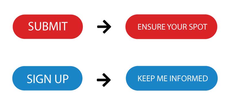
In many cases, landing pages are built with a generic call to action. For example, the button on a form requesting that a customer RSVPs to an event simply says “Submit,” or a request to sign up for a newsletter is labeled “Sign Up.”
So what’s wrong with these Call to Action buttons?
The answer is that they are weak and lack specific messaging. They do not invoke any sense of urgency, and they aren’t explaining exactly what visitors are getting when they click a button or submit a form.
What to Do Instead
Creating a strong call to action is similar to designing your landing page’s headline.
Ask yourself what precisely will happen when a customer takes action. Then, think about a way to create a meaningful message around that action.
For example, instead of “Submit” for RSVPing to an event, you could say “Ensure Your Spot.” Or, rather than saying “Sign Up” for a newsletter, you could say “Keep Me Informed.”
The goal is to create a compelling call to action that encourages a customer to convert because there is a clear value in doing so.

6. You Are Offering Too Many Exit Points
Take a look at your landing page. Does it contain all of your website’s normal navigation and menu options?
If so, you could be losing customers via too many exit points. There should be only one goal and one action that a landing page leads a customer to take. If you clutter the page with too much top-level navigation, you can end up losing customers via unwanted exit points.
What to Do Instead
Limit the navigation on your landing page. Create a distraction-free page with one clear path. If that is to sign up, schedule a service, or fill out a contact form, be sure that the customer can either take that action or leave. This can help reduce the number of distracting exits that reduce conversions.
7. You Aren’t Showcasing Your Social Proof
A landing page provides you with a quick opportunity to establish your brand with a customer. While you want to keep the page decluttered, make sure there is at least one social proof point that will help build trust with your customers.
If you don’t have any social proof, you can lose out on customers who aren’t yet loyal to your brand.
What to Do Instead
How do you best showcase your social proof? Add a widget to your landing page that highlights:
- Customer testimonials
- Online reviews
- The number of customers who choose your brand
- The number of stars you have earned on Google reviews
- Any industry-specific recognitions
8. You’re Using a Single Landing Page for Every Campaign
Building a landing page takes a lot of work, which is why many businesses rely on a single landing page for every marketing campaign they are running.
This is problematic in many ways:
- It will be hard to keep your message clear and the information on your page concise.
- It’s going to be difficult to track the success of a landing page if multiple campaigns are running at once.
- It will make it difficult to keep track of leads.
What to Do Instead
Instead of using one landing page for every digital marketing campaign you are running, build out a specific page for each campaign. This will allow you to be more concise in your messaging and use more powerful calls to action.
9. You’re Not Testing and Measuring
Once you have built your landing page, what happens next? If the answer is that you set it and forget it, your page will cost you important leads.
Just because a landing page worked well for a while doesn’t mean it will continue to do so. Not only that, but you can even improve upon a great landing page to become a better landing page.
What to Do Instead
Make sure that in conjunction with any digital marketing campaign, you are testing different iterations of your landing page and measuring the results.
A great way to do this is to start with a single variable at a time. For example, try changing the headline on your page. Does it have any impact on your results?
Make sure that when you test iterations of your landing page, you do so for at least a few weeks at a time. This will allow you to gather ample data on the changes for better optimization.
Build Superior Landing Pages with the Help of J&L Marketing
Your landing page can make or break your marketing campaigns. A well-built landing page helps you convert more customers and create long-term loyalty to your brand.
At J&L Marketing, we have years of experience building customized landing pages for our clients. We have learned what it takes to increase conversions through simple page improvements.
We’d love to share what we have learned with you, helping you stop lead loss.
If you are interested in learning more about what we can do, reach out to our team. We’ll start by looking at your existing landing pages and working with you to build a strategy from there. Stop wasting marketing dollars driving traffic to poorly built landing pages, and power your brand ahead of the competition with the help of our team.


