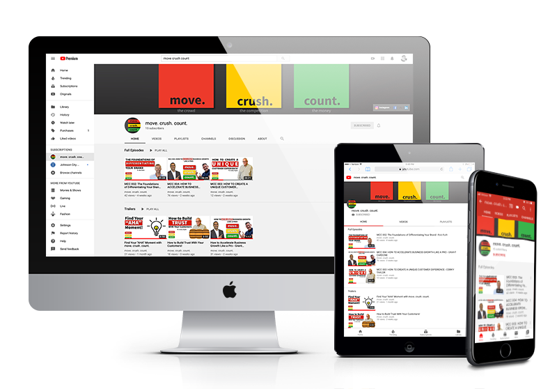
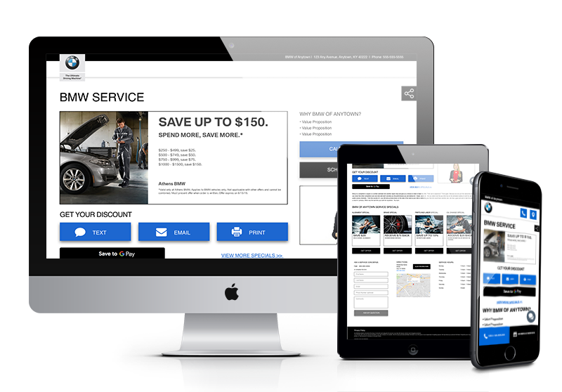
Think about how many devices you use in a day. At your dealership and home, you’re constantly switching between your computer and phone, and perhaps even your tablet. Your customers act similarly.
Studies show that 90% of people use multiple screens sequentially. With this in mind, each aspect of your car dealership’s online experience and marketing efforts must be compatible with every type of device.
The following are four key reasons why you should have a seamless experience across different types of devices:
1. Mobile Experiences Have a Direct Impact on Your Sales
Did you know that 48% of customers who bought a product began their search on a mobile device? That means that nearly half of your customers are searching for the vehicle they need on their phones before ever stepping foot into your dealership.
Customers are judging and analyzing your business long before they decide to visit your facility. From how your website works on their iPad to the emails they receive from your marketing team, customers expect a cohesive experience, regardless of the device they’re using.
2. Customers Use Smartphones as Their Sole Device
In 2016, Hubspot reported that one-third of people use their smartphone as their primary device to access the Internet. Imagine losing out on one-third of your potential customers because your website wouldn’t load or display content efficiently on a mobile device. Tragic, right?
We’re way beyond mobile marketing and mobile website design being an option for businesses. Now, it’s a core component of your marketing strategy!
3. Website Accessibility is Critical
Approximately 48.9 million people, or 19.4%, of Americans have some form of disability. If your website isn’t accessible or compatible with the devices used by these citizens, you’re missing out on yet another market.
With about 70% of reviewed websites not being compliant with accessibility standards, there’s a chance your dealership’s website is one of them.
4. Your SEO Results Rely On It
If you’re struggling to achieve and maintain solid search engine rankings and traffic, chances are it’s due to your website’s poor user experience. 61% of mobile searchers are more likely to contact a local business if they have a website that’s compatible with their device.
The goal of all your search engine optimization efforts should be to improve the overall user experience through a cohesive design, informational content, and flawless functionality.
RankBrain, a component of Google’s search algorithm, analyzes a website’s click-through rate (CTR), time on site, bounce rate, and other factors to determine if users are spending time interacting with that site. If your website and online content are staggeringly different from one device to the next, RankBrain will notice, and it will affect your search rankings online.
How to Improve Your Website’s Device Compatibility
Take a moment to look at your car dealership’s website on multiple devices. What does it look like to you? Do the content and layout remain the same, regardless of the device? Or does it adapt depending on which device you’re using?
What are the load times like per device? Is it easy to use the website on a small smartphone? How does the experience compare to a laptop or desktop computer? Can potential customers easily get the information they need about a car no matter what device they’re on?
If your user experience varies from device to device and causes a headache for customers, it’s time to take a hard look at how to improve your website’s device compatibility. When you’re ready to make significant changes to your car dealership’s online experience, keep these helpful tips in mind:
Invest in a Responsive Website Design
Several years ago, website designers and developers had the obstacle of creating entirely separate mobile websites. This mobile-friendly approach was valid for the technology of that time. Now, it’s a tactic of the past. Today, designers and developers need to accommodate for all types of devices—tablets, smartphones, laptops, smartwatches, etc.
With the need for a consistent user experience today, designers and developers use a technique known as “responsive website design”. As defined by the Nielsen Norman Group, responsive website design is “a web development approach that creates dynamic changes to the appearance of a website, depending on the screen size and orientation of the device being used to view it.”
That means that no matter what device your customers use to find and view your website, they receive a functional, appealing experience filled with the content they need.
Responsive website design isn’t only a user experience consideration. It’s an SEO ranking factor. In fact, as of 2016, Google’s search algorithm indexes the mobile versions of websites first. The information from these indexes appears in featured snippet rankings and other search-result functions.
Therefore, ignoring the need to ensure your website’s device compatibility through responsive design is a costly mistake for your car dealership.

Improve Website Load Times
Another typical mistake that leads to an inconsistent experience across devices is load times.
Car dealership websites are filled with information and media, such as:
- Current inventory details, photos, and videos
- Sales team bios and images
- Dealership images and video walkthroughs
- Educational blog posts and other helpful resources
- Service center scheduling tools and information
The list goes on and on.
All of that data leads to slow load times on specific devices if they aren’t optimized correctly. For instance, your website might load perfectly and quickly on a laptop device, but not on a smartphone.
Load times are a major SEO ranking factor, along with a significant sales consideration. Did you know mobile websites that load in five seconds or less will end in a viewing session that’s 70% longer than their slower counterparts?
If your website takes too long to load, you’ll fall lower in the search rankings, and you run the risk of potentially losing a qualified lead!
Moz recommends doing the following to increase website page speed across devices:
- Compress large files using a compression tool such as Gzip.
- Reduce the number of URL redirects on your website.
- Optimize images for the right size and file format.
- Use a content distribution network.
Reorganize Your Website Structure
In addition to having a responsive website design with fast load times, your website’s menu will contribute directly to compatibility with other devices. With this in mind, you’ll want to consider reorganizing the structure of your website content.
For instance, using a responsive design, you can fold the long menu seen on a laptop into the three-lined hamburger shaped icon on a mobile device or tablet. Otherwise, these button options would be overwhelming and not conducive to a productive user experience on a smartphone.
Also, use this opportunity to review your website content and pages in general. Do you still have pages with old, unnecessary content or sold inventory? If so, delete them from your website! It will help speed up load times and provide a seamless experience for customers from device to device.
The simpler your website navigation is, the easier it is for customers to use, no matter what device they’re on.

Limit the Number of Pop-Ups
From newsletter sign-ups to sales, cookie acceptances to sales team chat boxes, the number of pop-ups on car dealership websites is getting a little out of hand. Wouldn’t you agree?
Customers do too!
If you think these pop-ups are a nuisance on a laptop, it’s even more aggravating when you encounter them on a smartphone with a tiny screen.
To provide a pleasant mobile and laptop experience for customers, try to reduce the number of pop-ups you use. Or, think about how they’ll appear on a smaller device such as a smartphone. After all, studies show 81% of consumers have closed a browser or exited a webpage because of a pop-up ad.
Review Your Website’s Level of Accessibility
Lastly, take the time to review how accessible your website is across devices. Several areas of your website can likely improve to assist those with certain disabilities. For example, the colors you choose for your text and background can be difficult for people with color blindness.
For a full overview of accessibility guidelines and best practices, follow the advice of W3C’s Website Accessibility Initiative.
Device Compatibility Applies to Email Marketing, Too!
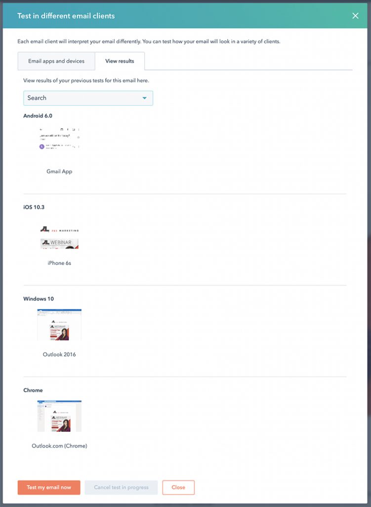
There are so many email platforms on the market these days, from Gmail to Apple Mail and Microsoft Outlook. Aside from the standard text emails, email marketing promotions will appear differently on each platform and device.
With this in mind, you must design your email marketing messages to appear perfectly on each platform and device.
Unfortunately, this isn’t the easiest task to complete. Each platform has its own restrictions, parameters, and coding requirements for messages.
To ensure your messages will appear correctly, regardless of the platform, enlist in the help of a testing tool such as:
- Litmus
- HTML Email Check
- Inbox Inspector

Test Everything
Whether you’re adjusting the size of an image on your website or double-checking that an email sends properly to Apple Mail users, you’ll need to test everything. Device compatibility isn’t a one-click solution. It’s an entire user experience strategy.
Make sure you dedicate a significant amount of time and resources to providing customers with a positive user experience, from their smartphone to their tablet and other devices.
Improve Your Dealership’s Device Compatibility with Our Help
If your inventory pages look odd on smartphones or you need a responsive website design, the J&L Marketing team can help. We’re ready to get to work with you to ensure that your car dealership offers a compatible online experience from the first search to the final sale.


